
How to Interpret Tables of GO, KEGG, and COG Analysis in Bioinformatics
GO (Gene Ontology) Analysis
1. Bar Chart
(1) Y-axis: Displays GO terms, with only the most significant ones shown if the list is extensive.
(2) X-axis: Represents either -log(p-value) or the number of associated genes. A higher -log(p-value) indicates stronger statistical significance.
2. Bubble Chart
(1) X-axis: Represents -log(p-value), where a larger value corresponds to stronger statistical significance.
(2) Y-axis: Indicates the number of genes associated with each GO term.
(3) Bubble size: Reflects the number or proportion of genes linked to a specific term.
(4) Bubble color: Represents significance levels; for example, deep red typically denotes a lower p-value.
3. Table
(1) Term: Name of the GO term.
(2) GO ID: Unique identifier for the GO term.
(3) p-value: Measures the statistical significance of term enrichment. Adjusted p-values (e.g., FDR, Bonferroni correction) are often provided.
(4) Gene count: Number of genes in the dataset associated with this GO term.
(5) Percentage (%): Proportion of genes in the dataset linked to this GO term.
KEGG Pathway Analysis
1. Pathway Diagram
(1) Nodes: Represent genes or proteins, typically color-coded based on their presence in the dataset.
(2) Edges: Indicate molecular interactions or functional relationships between pathway components.
(3) Coloring scheme: Highlights genes from the dataset, facilitating the identification of key players within the pathway.
2. Table
(1) Pathway: Name of the KEGG pathway.
(2) Pathway ID: Unique identifier for the pathway.
(3) p-value: Indicates the statistical significance of pathway enrichment.
(4) Gene count: Number of genes in the dataset associated with this pathway.
(5) Percentage (%): Proportion of genes in the dataset linked to this pathway.
COG (Clusters of Orthologous Groups) Analysis
1. Bar Char
(1) Y-axis: Represents functional COG categories.
(2) X-axis: Displays the number of genes assigned to each category, reflecting functional distribution within the dataset.
2. Pie Chart (if applicable)
(1) Sectors: Represent different COG categories.
(2) Sector size: Proportional to the number of genes in each category.
3. Table
(1) COG Category: Functional category represented by a letter code.
(2) Description: Full explanation of the functional category.
(3) Gene count: Number of genes associated with the given COG category.
(4) Percentage (%): Proportion of genes in the dataset linked to this category.
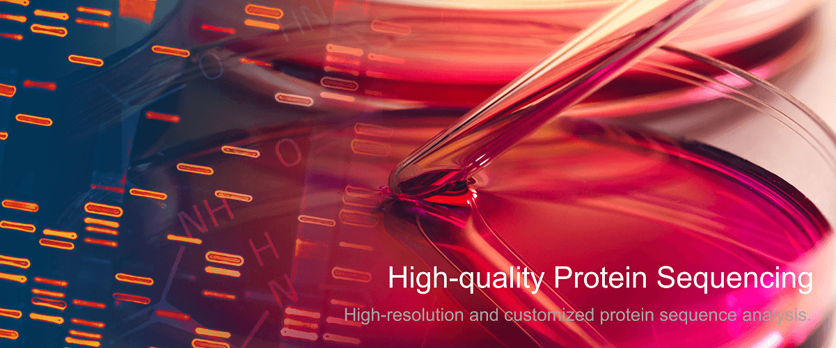
MtoZ Biolabs, an integrated chromatography and mass spectrometry (MS) services provider.
Related Services
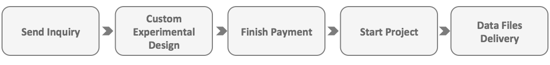
How to order?